Our Logo Design Process – Case Study
I thought it might be a good idea to explain and show how we work at creating your logo design. This way you will get a better understanding of what role you as a client will play, as well as time frames and how committed we are go to make sure that you will get your perfect logo. The best way to illustrate all this is to publish this case study. Thank you Jason Robert of Bass Bus UK, for giving permission to do this.
Agreeing on the Design Brief
First things first – we agreed on a Brief. We have an online form that clients can fill in, but Jason sent us an email with his brief. We had a telephone meeting, had a long conversation about his business, and about what he wanted from his logo. It is important to make sure that we have a thorough understanding of what services he provides. It may sound obvious, but this is fundamental. Otherwise, the design of the logo may look nice, but it may not communicate the right message, to your customers.
Our client explained that primarily, he organised Party Buses to circulate around London, making frequent stops in the Night Clubs and Bars. However, he wanted to avoid the drunken trouble-makers that marred so many nights in the past. His clientele would be aged between 21 and 40. The logo had to convey fun, party, but also sophistication. He wanted to let eliminate the ‘budget service’ feel the company currently had. His clients should be able to see that he provides a high-end service, by looking at the logo. The logo had to be part of the process for filtering his clients.
“Something that represents the Night VIP Economy.
– Jason Robert Owner Bass Bus UK

Their beautiful bus on one of their nights out in London.
Client gave Examples of Logos & Motifs used in the Industry
Jason gave us examples of logos and motifs that he liked. This is great, because it really helps our Graphic Designers get a better understanding of what you want. It’s very easy to misunderstand words, but images are direct.


Examples of the logos that competitors use, or were just liked by our client.
To be really honest…? We were not impressed. The logos his competition were using looked badly designed and ambiguous. A lot of them didn’t even look professional. The motifs were very masculine, which is not good, because that would alienate half his market. The Ministry of Sound is the exception – professionally designed.
However, we did notice a colour theme. We offered him a colour palette of Black, Gold and Purple. This colour scheme will convey the nightlife, fun and a little sophistication. These colours could always be changed in the future. Nothing is set in stone. We will use a Combination Mark. This means it will have both a Symbol Mark and the Word Mark (symbol and name of the company). This is so that it will be as clear as possible what the company does.
Other than this? Nothing. We told Jason, that we won’t tell our Graphic Designers anything else. We will organise a group of 5 Logo Designers. Let’s see what ideas they come up with. Give us 3-4 days, and we will send an email with at least five initial concepts. If one is good, we will develop it. If not, we will go back to the drawing board.
After about a week, we emailed Jason the Initial Designs. We also included a note, about how to take things further.
How To Judge The Logo Designs
Most of our clients are not designers themselves, they just know what they like and what they don’t like. To give this emotional task some process please follow these directions for judging the logo design.

- Avoid judging by committee. Design is very emotive and people will find it hard to agree on a single direction.
- Have one person in charge of the project with a strong personality if you can’t avoid the committee route. It is important to have a decision maker with the power to overrule.
- Break the design down in your mind in to it’s component parts; fonts, colour, layout, images and decide what you like and what you don’t like.
- If you can’t decide on any one direction for the design to move forward with, take a step back and let the images settle in your mind overnight. Start again the next day as something may have connected in your subconscious.
- If you want to go back to the drawing board, tell us why. Designers are not mind readers so it’s critical to say what you are not happy with. With the new information that you provide, the designers will be able to get a lot closer to your dream.
- A logo design is not a brand. Let me repeat that, as it is very important. A logo is not a brand. You build a brand, often over many years. Take for instance the Nike check mark logo. Everyone recognises this instantly around the world as representing quality. It has cost Nike billions of dollars to build that recognition. Just imagine for one second that we designed that logo for you today. Could you imagine the brand you could build using it or would you think you wasted your money having a designer draw a check mark? Design is very subjective so don’t lose heart if the first set of designs are not on the money. Let us know why you feel they are not right and we will fix it.
The Initial Design Concepts
Jason like the colour scheme. All 3 together had he right feel. These ideas gave our client a better understanding of what he wanted. Although he preferred the badges, he also thought that they did not make clear what it is that his company did. He was now very clear, that he wanted his logo to explain what he was about. Jason liked the idea of the Bus illustration, with the name at the bottom. What he wanted to change, was the bus, itself. He wanted the Double Decker, which was so iconic around London. He also wanted a different font.
The logo revisions
The next week, we sent Jason another email, with the first set of revisions attached. Again he looked at them and called us. He was happy that the logo was beginning to take shape. He liked the idea, that the logo was capturing basics of what the business is about; London Bus, Night, Fun. However, there was something he couldn’t place his finger on.

This is where our experience can really pay off. Clients generally don’t think visually. They know what they like, and what they don’t, when they see it. However, analysing why they don’t or do like something, is problematic. As a result, they don’t know how to take things further. The Logo Designers can only produce what they are asked to do. There is a lot of room for translation. Designers can not get inside your head. It can get very frustrating for both the clients and the Designers.
What was missing was the sophistication. And to be honest, the professional quality. We agreed with Jason, to get rid of the headphones and the drinks glasses. They were too obvious, and tacky. Finally, we needed the logo to be illustrated in a style that conveyed energy, fun. And drawn in an illustrated style, as opposed to a photographic style.
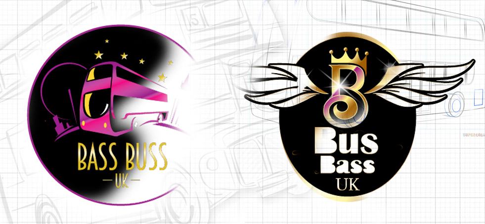
The first set of logo revisions.
The second set of revisions
4 days later, we had our next meeting with Jason, and discussed the latest set of revisions. Jason knew immediately which design he wanted to go for. This is a good sign. The logo, when done correct, gets to you intuitively. You don’t need to think things through. The only thing he wanted to change was the typeface. He was in two minds about adding stars. We advised having some kind of border, so that the logo can be produced on a white background, and look smart.

The second set of revisions that our Logo Designers provided.
The Third set of revisions
Everything was pretty much perfect, but he client was still not completely satisfied with the Word Mark part of the logo. We felt, that with the stars, there was a little too much going on. However, the client is King, and so we kept everything in. We only shaved off some of the buildings in the background.

The third set of revisions from our Designers.
The final logo design

The final logo.
Jason is delighted with his logo. He made a presentation to his his staff and other businesses that he worked with. His accountant agreed that the company would find it easier to charge a higher rate for their services. His sales staff agreed that making sales while visiting business premises would be easier.
Jason made a Social Media post across all his platforms, announcing the new logo design. His followers gave a big thumbs up, and it led to a big discussion about his next night out.
How the Logo has Been Used

Social Media
Now that the client has the logo – now what? Well use it! The obvious place is on your social media platforms. Actually, this is vital. Google My Business, Facebook, Instagram and all the others, actively look at your profile to see if you have a professional logo. Furthermore, they want to see that it is faithfully reproduced across all your platforms. This will affect your website rankings, as well as your social platforms reach.
This is especially important for our client, as most of his clients approach him from his business Facebook account. Therefore, he wanted to look professional to the social media companies, as well as the potential clients.
Printed on Staff Uniforms

There are a number of reasons as to why the logos need to be printed on uniforms. First and foremost – safety. A lot of the patrons of this clients’ are ladies in groups having fun, letting their hair down and relaxing in the City of London. The staff, made up of Door Persons, Club Reps and Events Management are held accountable for everyone’s security. They need to stand out from the general public. All their patrons should know that they can trust them with their issues, as soon as they see them.
The uniforms are also worn outside of the actual events. Sale Representatives often approach small to medium sized companies, for staff outings or Christmas parties. Wearing branded long-sleeved shirts and trousers, gives both the sales staff and the potential patrons confidence.

Naturally, we provide this service, making sure that the logo has been replicated faithfully, in position correctly on the garments. Then delivered to the clients address.
You Tube Channel
As a result of the current climate – Social Distancing – Bass Bus UK have invested in their online client base, and now started to turn them in to an online fan base. They have always been rubbing shoulders with D.J’s, musicians, and Bars across the U.K. They have decided to create an online channel, where they conduct interviews with their friends and colleagues. This was a prime opportunity to get our animators to work. We contacted our animator and a Sound Engineer that has worked with us in the past. We created this intro for all future videos.
Take a look at more of our logos designed. We have worked with a large number of industries. We normally use this process with our clients and designers. It tends to make the whole process enjoyable and productive for everyone.


