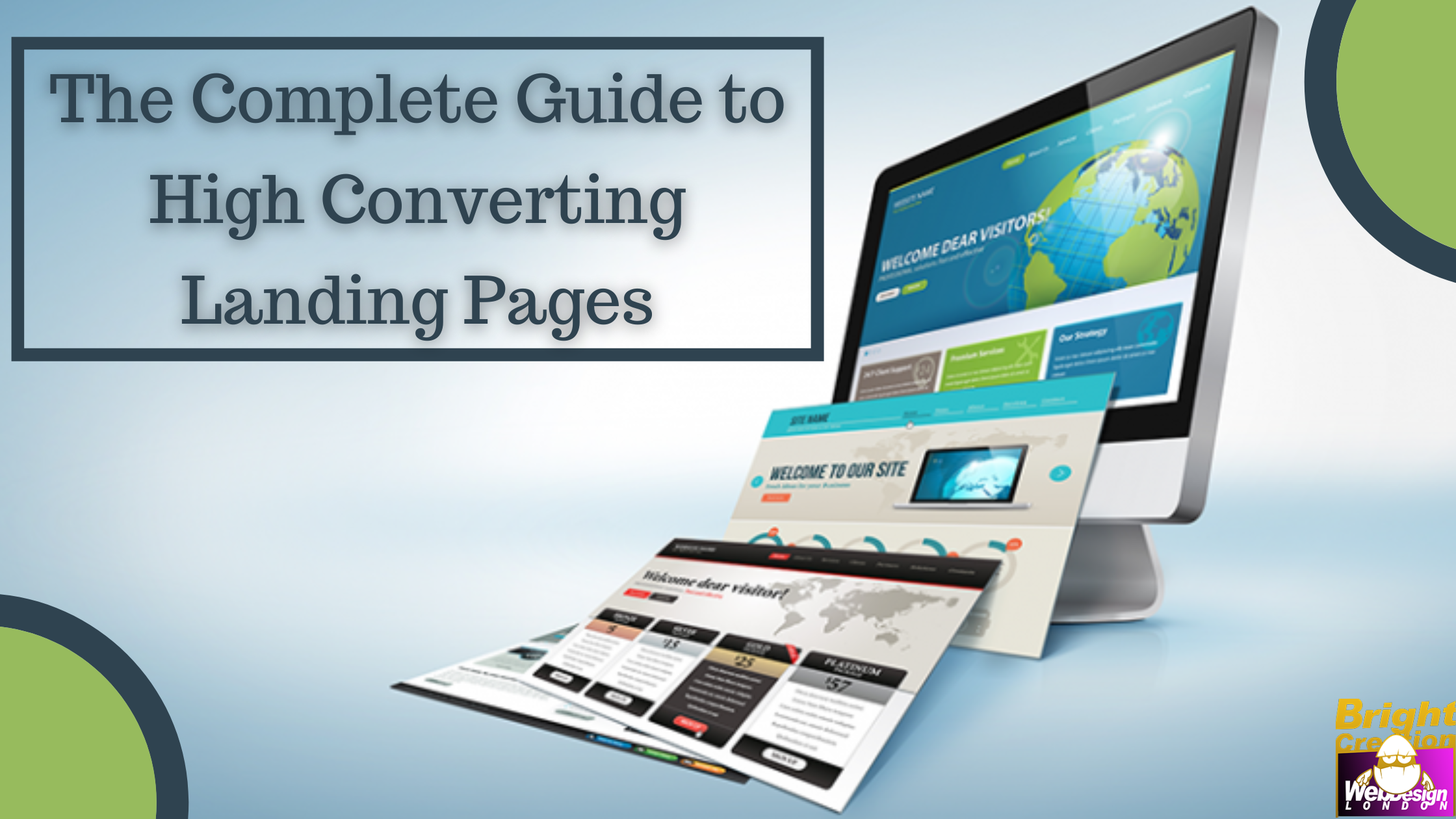
The Complete Guide to High Converting Landing Pages
How often do you click a link and are taken to a specific page that asks you to take some kind of action? It is a landing page.
They are specifically designed to encourage visitors and convert them into leads or customers. Hence, creating a well-structured landing page is critical because it should compel people to submit their personal information.
Hire a professional web design company to design a targeted and high-converting landing page that is appealing to customers and equally functional.
How does a landing page differ from other web pages?
Generally, regular website pages have more than one CTA and have many purposes. For example, fill out a contact form, sign up for a free trial, or learn more about key features.
Similarly, your blog page, about page, services page, and others have various goals.
However, a talented and experienced web design agency in London will keep one goal and one CTA for a landing page.
How to design a landing page?
Designing a landing page is more than colours, creativity, and beautiful pictures. It also involves functional, effective, and direction-focused. In a nutshell, it is an amalgamation of creativity and technicality.
Structure
A structure of a landing age generally has some common elements, which include:
- A catchy headline
- An image that relates to the audience
- Lead form to get visitor’s information
- Action-oriented call-to-action
- Description and copy to inform and engage your audience
When creating a landing page structure, you need to understand the buyer’s journey to include relevant information.
Take help from the best web development services provider to create an excellent landing page structure.
Page layout
Landing page layout is critical because people do not have time to read everything you show. They often aim to take in the most important and relevant points. Hence, it is crucial to highlight and put those points in front of their eyes.
- Keep important data above the fold
- Allow visitors to gather key points in a blink
- Keep optimum white space
- Add bullet points
Colours
Your landing page should reflect the colours of your brand. It increases brand awareness and builds a long-term relationship with customers. In addition, when people recognise your brand often, they trust you more.
However, your CTA button should have contrasting colours. It draws the attention of people.
Images
People like to engage more with visuals than a block of text. There are innumerable photos available to choose from, but to select them for your landing page, you can consider the following aspects:
- Your target audience
- The place you want to attract an audience
- Use images that add value
Call-to-Action

CTA is the most important part of your landing page, and it should be designed strategically.
- Use contrasting colours
- Be straightforward and useless words
- Distinctly tell visitors what you want them to do (subscribe, signup, etc.)
- Keep the area around CTA uncrowded
- Place your CTA in a flow where people can easily find it without any interruption
Tips for writing a great landing page copy
When you write a copy for a landing page, it is essential to trigger a few points.
- Include problems of your audience and show empathy
- Now offer solutions and highlight how they can help them
- Highlight significant features of your product/services and how they can help them
- Your copy must include every benefit because people want to know them
- Add public reviews and testimonials
- Offer triggers like ‘money-back guarantee’ and ‘a line from a happy customer.’ Add these triggers around CTA to push your prospects
You can also add targeted keywords to attract more customers. So, to add strategic and relevant keywords, take help from an SEO service in London.
A/B test or split test your landing page
After creating a high-converting landing page, it is time to test its different versions and decide which works the best.
It is important to know if the elements and copy you used are working or not because every target audience group is different. Hence, they like different things.
What exactly is A/B testing?
Split or A/B testing is splitting your visitors into two and offering them different landing pages to analyse which works well.
You can conduct such a test manually by showing a particular design for a certain period and then another. However, you can also use software to carry out A/B tests and examine results.
What should you change in your landing page for effective A/B testing?
You can literally alter anything you desire on your landing page. However, let us read further about some significant elements you should consider.
- CTA colour and placement
- Headline of copy
- Image
- Click triggers
- Copy
Though you have the liberty to change anything and everything, you should not modify all the elements at once. It will create complexity and confusion while tracking.
Also Read: 4 ways website design affects content marketing
Tips to enhance your high-converting landing page
Strip off-site navigation from a landing page
A landing page should concentrate on one goal and one CTA. So, people will not be distracted and focus on what you want them to focus on.
Create different landing pages for different audiences
You will send each person to the same landing page initially. However, it is beneficial to serve varied landing pages that appeal to each audience group when you advance.
Optimise page load time
Poor landing page load time can frustrate visitors and prompt them to leave the site immediately. Hence, it should be optimised to load speedily.
Show a clear and concise path toward conversion
When people drop by your page, they should get a clear idea of what you want them to do. For which you can highlight CTA and use a bold outline to highlight it.
Create FOMO
People consciously or unconsciously develop FOMO. Hence, when you show that your product or service is in high demand and also display its shortage, they will want to get it.
Conclusion
Though landing pages are the least favourite type of signup form but have a maximum conversion rate of 23%.
So, to create an excellent landing page and boost your conversion rate, hire a professional web design company.


